January 30, 2026
You Can’t Improve What You Can’t See: How to Measure Salesforce Data Quality with Cloudingo
Everyone says data quality matters... until someone asks, “How do we know it’s actually getting better?”
Duplicates get merged. Automation runs quietly in the background. Admins put in real work cleaning Salesforce. But when leadership asks for proof, most teams are left pointing to effort instead of outcomes. No baseline. No trend line. No clear way to show progress.
That’s the gap Cloudingo’s Data Quality Dashboard (DQD) and reporting are designed to close. They don’t just help you clean Salesforce data — they help you see improvement over time, prioritize the right fixes, and explain the impact in a way the business understands.
Why Data Quality Without Visibility Always Falls Flat
Most Salesforce teams are already doing the right things:
- Running deduplication
- Fixing ownership issues
- Standardizing values
- Automating cleanup jobs
The problem isn’t execution. It’s visibility.
Without dashboards and reporting, data quality becomes:
- Reactive instead of strategic
- Difficult to prioritize
- Nearly impossible to defend when budget or resources are questioned
If you can’t answer “Are we improving?” with confidence, data quality will always feel like background maintenance instead of an operational advantage.
The Data Quality Dashboard: Measuring Progress, Not Perfection
The Data Quality Dashboard provides a high-level snapshot of Salesforce data health, designed to surface the most common structural issues that slow teams down.
Instead of focusing on individual records, the DQD highlights systemic blockers — the kinds of problems that quietly undermine automation, reporting, and scale.
What the DQD looks at:
- Inactive record owners
Records owned by inactive users often block updates, merges, and downstream processes.
- Inactive picklist values
Active records using outdated values can break automation and reporting logic.
- Broad duplication signals
General indicators of duplicate risk across Leads, Contacts, and Accounts.
The goal isn’t to overwhelm you with detail. It’s to quickly answer one question:
“Where are the biggest data quality risks in our org right now?”
If you want a detailed breakdown of everything included in the Data Quality Dashboard, Cloudingo’s help documentation walks through each section and metric step by step.
Why the Trend Line Matters More Than the Score
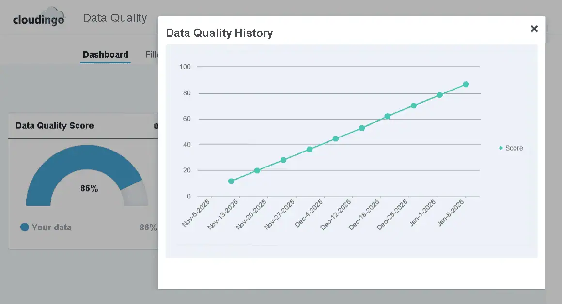
One of the most useful parts of the DQD isn’t the score itself — it’s the history.
Seeing your data quality improve week over week changes how teams think about cleanup. Instead of a one-time project, it becomes an ongoing program with measurable momentum. That upward trend is the real signal.
This is the difference between:
- “We think our data is better.”
- and “Here’s the trend line to prove it.”
Consistent improvement builds confidence, encourages adoption, and makes data quality feel achievable instead of endless.
Understanding the Data Quality Score (Without Chasing 100%)
The Data Quality Score often raises eyebrows — especially when teams realize 100% isn’t realistic.
That’s intentional.
The score is a composite indicator based on generalized signals like inactive owners, inactive picklists, and high-level duplication logic. It does not use your custom dedupe filters or org-specific business rules.
Why? Because every Salesforce org defines “duplicate” differently.
The score is designed to:
- Track directional improvement
- Highlight systemic risks
- Help teams prioritize cleanup.
Reality check:
If you’re in the 80–90% range, you’re doing very well. The score is a compass, not a finish line.
Cloudingo Reports: Where the Proof Lives
While the DQD answers “How healthy is our data?”, Cloudingo’s reports answer a different — and equally important — question:
“What did Cloudingo actually do?”
This is where admins and ops teams go when they need hard evidence.
Key reports include:
- Duplicate reports
Track how many duplicates are identified and how that number changes over time.
- Merge & Convert reports
See every merge and conversion job, including volume and outcomes.
- Automation reports
Monitor scheduled and real-time jobs to understand impact and reliability.
Each report provides:
- Visual trends and historical charts
- Record-level detail (master vs merged records)
- Success and failure tracking
- Exportable spreadsheets
- Optional scheduled delivery to your inbox
Learn more about reporting inside Cloudingo on our help website here.
Pre-Merge Reporting: Confidence Before You Commit
For teams that need extra validation, Cloudingo also offers pre-merge reporting.
These reports allow you to:
- Review matched records before merging
- Preview what the final merged record would look like
- Export results for stakeholder or compliance review
This is especially valuable for regulated industries or orgs managing large-scale cleanup initiatives where trust and transparency matter.
How the Dashboard and Reports Work Together
Think of it this way:
- Data Quality Dashboard = How healthy is our data overall?
- Reports = What actions were taken and what changed?
A simple workflow looks like this:
- Identify problem areas using the Data Quality Dashboard
- Apply Cloudingo automation or cleanup
- Track results and volume in reports
- Share outcomes with leadership using real data
Visibility changes behavior. Once teams can see progress, data quality stops being abstract and starts becoming operational.
Clean Data Is Important. Proving Its Value Is What Gets Buy-In.
Dashboards show progress.
Reports show activity.
But when leadership asks what bad data is actually costing the business, you need numbers — not gut feelings.
That’s where the Cloudingo ROI Calculator comes in to support reporting real numbers.
It helps teams quantify the real cost of:
- Duplicate records
- Manual cleanup
- Ongoing data decay
Using your own inputs, it generates executive-ready outputs designed to support budget conversations and strategic decisions.
